Using The Pen Tool and Other Special Effects Tools in Adobe Photoshop
Whenever you draw an object using the Pen tool, you create paths. One path is made up of one or more curved or straight lines known as segments. The start and end point of a segment is called an anchor point. An anchor point is a point where you can modify the segment.
That said, paths can be open or closed. Open paths have open-ended points. A line is an example. A circle is an example of a closed path because the endpoints are connected.
Creating Straight & Curved Paths
Let's draw a simple path so we can see one for ourselves, and discuss its attributes. Select the Pen tool  and position it anywhere on your document. Unlike the pencil tool, you do not actually "draw" paths with the pen tool. You simply click to create anchor points.
Look at what we mean:
In the snapshot above, we clicked once using the Pen tool to create a point.
Now we click again in a different location to create another point. Photoshop automatically creates those two points. This is an open path.

Now, we can add anchor points until we get back to the starting point and make a shape just like in the next example. This is a closed path.

We have now made a square that can be manipulated just like any other shape in Photoshop CS6. You can apply a stroke, fill it, convert it into a selection, etc. In fact, when you use something like the rectangular tool, you're just creating a series of paths.
What makes the Pen tool even more useful, is that you are not constricted by a pre-existing shape, such as a circle or a rectangle. You can create almost any kind of shape.
Let's make another path, this time we'll curve it. Click an area to create your starting point. Now reposition the pointer and instead of just clicking quickly to create an ending point, click and hold the left mouse button and drag the mouse. You'll see the line curve.
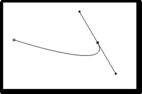
In this example, you can see our starting point (indicated by the empty anchor point on the left) and our ending point (the black box.)
So now what is that other line and what do those circles at the end of it mean? That line is how Photoshop controls the length and slope of the curve and those circles are the handles. You can use the arrow (or selection tool) to click on and drag those handles to different locations.
Before we go on, take a minute to experiment with this feature since it's much easier to understand if you see it in action. Click a handle and drag it around and note how different positions and different line lengths affect the curve. And remember, that these lines are not actually part of the path. When you close a path and it becomes a shape, the lines vanish.
Now take a look at the Paths Panel. If the Paths Panel is not visible, you can click Window > Paths.
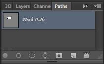
As you can see, the Paths Panel is arranged very much like the Layers Panel. Whenever you create a path, it automatically appears here with the name "Work Path." Work Path in this case actually means "temporary." The way to make the path permanent is to rename it. To do that, double click on the name and enter a new one in the box that opens.
Let's take a look at some of the other tools associated with the Pen tool. Go to the Pen button on the toolbar and click and hold it to view the dropdown menu.
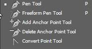
The Freeform pen tool  allows you to draw paths without anchor points, pretty much the same way you'd draw a picture.
Now, look at the last three items on the list. They are "Add Anchor Point Tool," "Delete Anchor Point Tool," and "Convert Point Tool." To delete an anchor point, select the tool, and simply click on an anchor point. To add an anchor point, select the tool and click anywhere on a path to add an anchor point.
Creating Combo Paths
A combo path is, quite simply, a path that has both straight and curved lines, or even curved lines that run opposite each other. To understand combo paths, we have to take a closer look at our anchor points.
There are two kinds of anchor points in Photoshop CS6. They are "smooth points" (as in the example on the left) and "corner points" (as in the example on the right.)
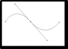
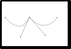
You may have noticed, while you were experimenting with curves, that when you create one curved line segment, the line segment that follows it will be curved too. This is one of the things that adds to the frustration that beginners have toward the Pen tool, but it's quite easy to correct.once you know what you're doing. Or, more precisely, once you've discovered the convert tool.
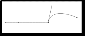
As you've already discovered, when you create a curved line segment, it creates a direction line, sometimes two. One direction line affects the line segment right behind the anchor point, and the other effects the segment just ahead of it.
So in order to straighten out one of the lines or adjust the curve of one without affecting the other, you'll need to be able to see those two direction lines. If both aren't visible, you can select the convert button and click on the anchor point with the curves you want to adjust. This will convert it to an ordinary anchor point. Now click it again and hold. Now drag a new direction line. This should create two, one opposite the other.
Now you can click the handle of one of the direction lines and drag it until the line is straight. You can then use the other direction handle to fine tune the curve. Take a moment to experiment with this before moving on.
Creating a Clipping Path
Sometimes, when printing a Photoshop CS6 image, or when using it in another application (such as a page-layout application like InDesign) you may want to hide certain portions of the image. For instance, you may want to exclude the background, or show only a rock or a road sign. A clipping path lets you isolate the part you want to appear, while making the rest invisible.
You can use the pen tool to create a clipping mask.
In the following example, we've used the Pen tool to select the shadow around Lincoln's eye. By using different kinds of curves and anchor points, we can shape the lines around almost any kind of shape, as you can see.
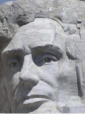
Remember that when you create a path, Photoshop automatically names it "Work Path." Since we want to save this path, we must rename it. So we'll double-click on the path and call it "Lincoln's Eye."
Now click the menu button in the upper right-hand corner of the Paths Panel and select "Clipping Path."
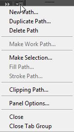
You'll see a box that looks like this.

Make sure the proper path is selected in the box and leave the Flatness box blank. This allows it to use the Printer's default value. If you have trouble printing the picture properly, you can experiment with different values (values range from .2 to 100.) Click OK.
Creating Special Effects
The ability to add special effects to your photos is one of the most enjoyable features of Photoshop. With a few clicks of the mouse, you can transform an ordinary family photo into a work of art. Photoshop CS6 can simulate all sorts of artistic techniques, including oil painting, charcoal sketching, and water-coloring. You can also blur images, emboss them, distort and stylize them, and much, much more.
Getting Started with Photoshop Filters
The special effects in Photoshop CS6 are called "Filters." And really, it's not a bad way to think of them-like seeing your images through a special lens. Think of those mirrors in the funhouse at the carnival. Photoshop CS6 even has a few filters that can simulate those magic mirrors:
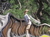
It can be as if your pictures were printed on Silly Putty instead of paper.
Take a moment to find Filters in the Menu bar at the top of the Photoshop screen and click on it. Here you will find a list of filter categories that looks like this:
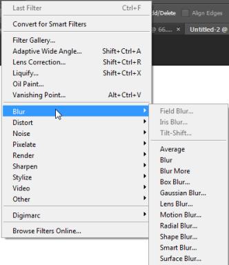
Click each category to see the filters available to you, as in the example above.
Here we've clicked Brush Strokes > Crosshatch:
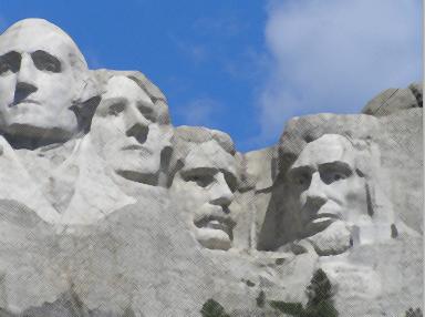
While some filters will simply take effect as soon as you select them, others may have options that allow you to fine tune the final look. For instance, in the example above, we had the ability to change the length of the stroke in the crosshatch, the strength of the stroke, and the sharpness of each stroke. If this is the case, the Filter Gallery will open, allowing you to make these adjustments before any changes are applied to your picture.
One thing you should remember is that filters are applied only to the active layer.
Filter Gallery
The Filter Gallery is actually a great way to search for and apply effects to your images because it gives you the chance to see what your image will look like with the effect before you actually apply it.
To find the Filter Gallery, click Filter > Filter Gallery. The Filter Gallery looks like this:
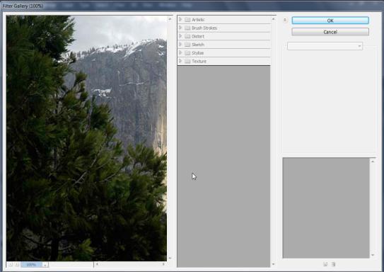
The image on the left is the preview. Look at the little box just below it that says 100%. You can use this box to change zoom in our out of your photograph. A lower number will allow you to squeeze the entire image on the screen, as in the next example.
The different filter categories are listed in the middle box. Click a category to expand it. We'll then select "Underpainting."
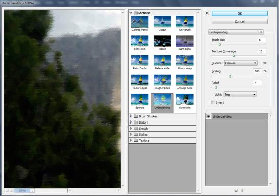
As you can see, we now have a few extra options that will let us fine tune the look of our photograph. Some other filters may have a few different options, but the concept is basically the same for all of them.
In this instance, we have the ability to change the brush size, the texture size, and so on. We can choose the Texture dropdown menu to simulate the type of material our picture is painted on. In this case, it is sandstone.
Changing any of these options can significantly impact the final look of your photograph, so experiment with different settings. In fact, you should take this opportunity to test the process out for yourself. Launch Photoshop CS6, load your favorite picture, and try using the different filters. Try all of the different options at different settings and see what they look like. Just don't over-write your originals.
Smart Filters
One of the problems with using ordinary Filters to alter an image is that once you've applied it, you can't go back later and edit the settings. The pixels of the image itself have been irrevocably altered. This is called "destructive" editing. (Note: You can still go back and "Undo" a recently applied filter.) That is why it's always a good idea to work on a copy of an image, rather than the original.
To address this issue, Photoshop came up with the idea of "Smart Filters." They make it possible to go back at any time and change the settings of any filter. What's more, you can stack them just like layers, make them opaque, or use them as masks to add an effect to just one area of an image.
To create a Smart Filter, you must first convert the image into a Smart Object. Go to Filter > Convert for Smart Filters.
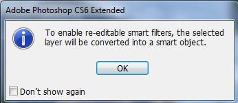
Click OK.
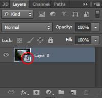
You can now open the Layers palette to verify that your image has been converted to a Smart Object. You'll see an icon over your image that looks like this (we've circled it in red):
Now, you can add a filter just like you would under ordinary circumstance. We'll select Artistic, Paint Daubs, with a brush size of 22, a sharpness of 30, and a "Sparkle" brush type from the Filter Gallery.
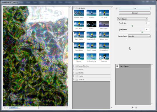
Now take a look at the Layers palette. The smart filter appears just under our image in the hierarchy with the type of filter right under it.
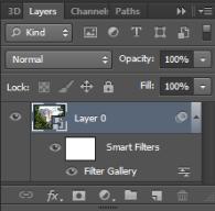
If you were to add another filter, it would appear above the first, and so on. The layers can now be moved, deleted, or hidden just like an ordinary layer. To adjust any aspect of a filter, you can now just double-click its name to launch the Filter Gallery menu, and experiment to your satisfaction, content that you can edit the settings at any time.
Creating Text Effects
You can warp it, wrap it around objects, add drop shadows, and more.
Warp Text
There are a number of ways to warp text. You can make it follow an arch, twist it, make it bulge, inflate it and more.
To warp text, select a text layer and click the Warp button on the Options bar. It looks like this:  . The Warp Text dialogue will open. Select a style from the dropdown menu. By default, "None" is selected and no options are available. We'll select "Fish."
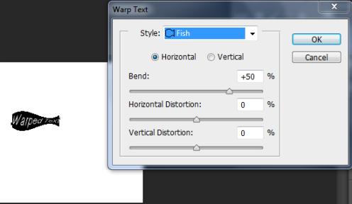
The effect is automatically applied. You can now manipulate the look of the text by adjusting the bend, horizontal distortion, etc. Click OK when you're ready.
You can remove the warp at any time by selecting the type layer with the warped text on it, clicking the Warp Text button, and selecting None from the Style dropdown menu.
Before we continue, please take a moment to go through the Warp Text style options and familiarize yourself with them. Try applying them to text and adjusting the available options. This will give you a good understanding of the text warping capabilities of Photoshop CS6.
Typing Text on a Path
Now you'll learn how to make text follow those paths and any other kind of path. In this example, we've created a path with the pen tool, and then made our text follow it:
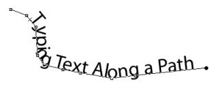
So let's do it. Create a simple path with the Pen tool. Now select the Text tool  and place the pointer over the path in the position you want to begin your text. When the pointer is over the path, it will look like this:
  . Click your mouse and begin typing. The text will run in the direction the anchor points were added.
Text typed along a path can be oriented either horizontally, or vertically. Vertical text appears parallel to the path, while horizontal text appears perpendicular to it.
In the example above, we selected the horizontal type tool. To type vertical text, right click and hold the text tool then select the vertical text tool. It's the one with the arrow beside it that looks like this:  .
.
You can move the text only by moving the entire path. To change the shape of the text, simply drag the anchor points to another position.
Applying Gradients to Text
Text is basically just another object in Photoshop CS6, so it can be treated just like any other object. It can be used as a mask, it can be moved, colored, manipulated, etc. However, applying a gradient to your text isn't quite as easy as using the Gradient tool in the tool bar.
Click the type tool and type your text. Make sure the new layer with the text on it is selected. Now, duplicate that layer by right clicking on the layer in the Layers panel and selecting "Duplicate Layer."
With the new layer selected, right click on it and select "Rasterize Type."
Rasterizing is simply the process of converting a vector image to a bitmapped image.
Right click on the layer again and select "Blending Options."
This will launch the Layer Style dialogue box. From here you can add drop shadows, inner shadows, outer glow, etc., so feel free to come back to this step and experiment and become familiar with the various options and how they appear on the page.
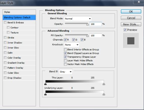
Since we're only interested in adding a gradient to our text at this point, we're going to select "Gradient Overlay" from the menu on the left. If you have the Preview box checked, the options you select will automatically apply to the text as in the example below.
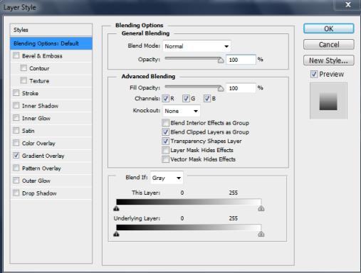
You may have to reposition the Layer Style dialogue box on the screen to be able to see your text.
You can select any combination of styles to apply to text. In our example, we'll add some stroke options to our text as well.
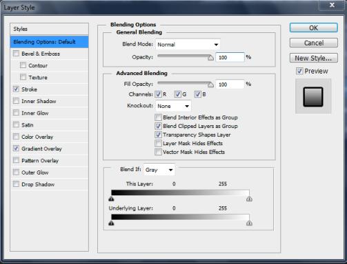
Click OK when you're finished and take a look at the Layer's panel.
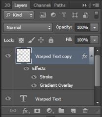
Here's our text: 
As you can see, the effects we added to our text act identically to the Smart Filters we learned about earlier. You can double-click any of the sub-layers associated with the effects to change the values and alter the appearance of your text.


